
Meteogram 7-Day
The Meteogram 7-Day is a multi-purpose meteogram which provides detailed weather information for a time range of 7 days, and is available with a point+ subscription.
Display
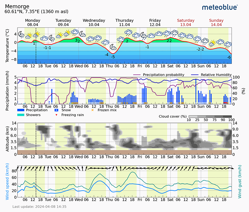
This meteogram shows four different diagrams featuring a selection of different weather variables in hourly intervals for the next seven days.
In each of the diagrams, daylight is indicated by a light yellow background, whereas white background signifies nighttime. All displayed data are valid for the selected location, available for any place on Earth, and updated whenever the meteogram is accessed.
The time of the most recent model update can be found at the bottom left of the meteogram. In addition to model data, however, the meteogram is also updated with nowcasting data. All data are displayed in local time, the dashed line shows the current time.
Displayed weather variables
The meteograms shows information about the following weather variables:
Temperature
The first diagram displays the hourly temperature for the next seven days. The area under the temperature curve is filled by layered colour bars to improve readability. The minimum and maximum temperatures of each day are displayed as numbers. Additionally, pictograms on top of curve show the weather conditions.
Precipitation
The second diagram shows the precipitation amount (vertical blue bars), type (symbols on the bars), probability (purple curve) and the relative humidity (blue curve).
The precipitation amount is shown in millimetres (1 mm corresponds to 1 litre per square metre), or inches, depending on the unit you have selected. The total precipitation amount (dark blue bars) is the sum of showers (light blue bars) and frontal precipitation (not indicated separately). Precipitation types are rain (no separate symbol), snow (*), frozen mix (x), and freezing rain (▼).
Precipitation probability is calculated from an ensemble of 20 model runs. The probability displayed is the degree of consensus of these 20 different forecast calculations with regard to precipitation occurring at a given timestep. This calculation is usually made for an area (grid cell) of 50x50km.
Clouds
The third diagram displays the cloud cover as a function of the altitude (in km) and time. The bottom of the chart (brown bar) indicates the average altitude of the surrounding area. Cloud cover is shown in grey scale steps (in %). Zero percent means that there is no visible cloud on the sky, 50 percent is equivalent to half of the sky covered with clouds. 100 percent cloud cover means no clear sky is visible. If clouds are shown at low altitudes, it can either mean low clouds or fog.
From the clouds' height, density and sequence, the expected weather type can be interpreted. A typical cold front starts with low clouds, which build up over time. Thunderstorm weather is characterised by cloudless mornings and rapid cloud development during the day, with dense and high clouds in the afternoon, which may disappear again during the night.
Wind
The final diagram shows the wind speed (light blue curve), wind gusts (dark green curve) as well as the wind direction as arrows. All displayed wind data are calculated for 10m above ground. The wind direction is shown in 3-hour intervals with arrows. E.g., when the arrow points to the top, there is south wind, pointing to the right means west wind etc.

