Air Quality & Pollen
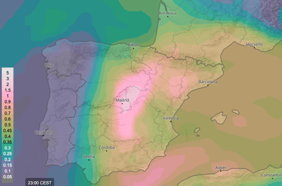
Air quality (CAQI)
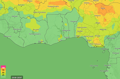
This map shows the expected quality of air with the air quality index, that is divided in five classes, visualised with colours as shown in the map legend. Lower values mean better air quality, whereas an index greater than 100 (pink) indicates polluted air. For more information, see air quality.
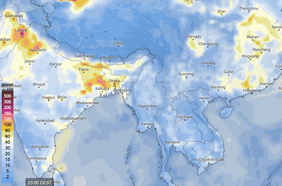
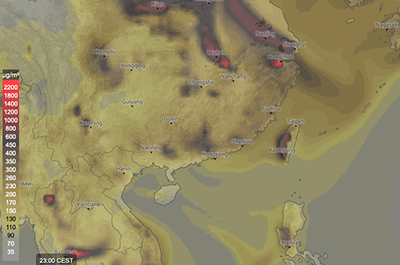
Desert dust
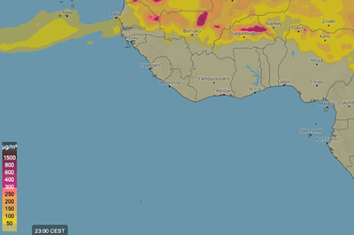
This map shows the expected concentration of desert dust with colours as indicated in the map legend. The concentration is given in microgram per cubic meter (μg/m3). Different altitudes can be chosen to display the desert dust concentration. Desert dust can be transported by the wind on a global scale. Saharan dust, for example, is transported as far as the Amazon region, where it compensates for the nutrients lost through leaching and makes an important contribution to the functioning of the ecosystem. For more information, see desert dust concentration.
Ozone concentration
This map shows the expected ozone concentration, expressed in microgram per cubic meter (μg/m3). It is displayed with colours, that are specified in the legend. Combining the ozone concentration maps the wind animation for instance may give information about where ozone is transported. Ground-level ozone is an air pollutant that is harmful to respiratory tract and plants. In contrast, ozone in the stratosphere is important and protects organisms on Earth from the sun's harmful ultraviolet (UV) rays. For more information, see ozone concentration.
Aerosol optical depth
This map shows the expected total aerosol optical depth (dimensionless) with light of wavelength 550 nm. The aerosol optical depth describes the exponential attenuation of incoming solar radiation through the atmosphere by particles and is visualised with colours as indicated in the map legend. For more information, see aerosol optical depth.
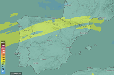
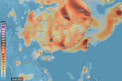
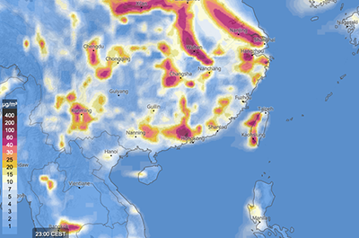
Particular matter
These maps show the expected particulate matter (PM10 and PM2.5) concentration with colours as indicated in the map legend. The concentration is given in microgram per cubic meter (μg/m3). Atmospheric particulate matter are microscopic solid or liquid matter suspended in the air. For more information, see PM10 and PM2.5.
SO2
This map shows the expected SO2 (sulfur dioxide) concentration with colours as indicated in the map legend. The concentration is given in microgram per cubic meter (μg/m3). Different altitudes can be chosen to display the SO2 concentration. Sulfur dioxide is a gas, which is invisible and has a nasty, sharp smell. About 99% of the sulfur dioxide in air comes from human sources. SO2 and other sulfur oxides can contribute to acid rain which can harm sensitive ecosystems. For more information, see SO2.
NO2
This map shows the expected NO2 (nitrogen dioxide) concentration with colours as indicated in the map legend. Nitrogen dioxide is one of several nitrogen oxides. NO2 is introduced into the environment by natural causes, including entry from the stratosphere, bacterial respiration, volcanos, and lightning. For more information, see NO2.
CO
This map shows the expected CO (carbon monoxide) concentration with colours as indicated in the map legend. The concentration is given in microgram per cubic meter (μg/m3). Carbon monoxide is a colourless, odorless, and tasteless gas that is slightly less dense than air. Carbon monoxide is present in small amounts in the atmosphere, chiefly as a product of volcanic activity but also from natural and man-made fires (such as forest and bushfires, burning of crop residues, and sugarcane fire-cleaning). For more information, see CO.
Pollen
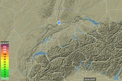
These maps show the expected grass, ragweed, birch and olive pollen concentration with colours as indicated in the map legend. Pollen is dispersed by air currents and can be transported over large distances. For more information, see pollen.
- Grass Pollen
- Ragweed Pollen
- Birch Pollen
- Olive Pollen

