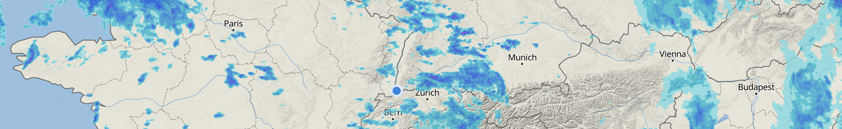
More Maps
CAPE & Lifted index
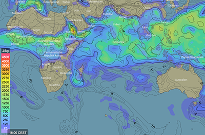
CAPE stands for Convective Available Potential Energy. It is a measurement of the amount of energy available to a buoyant parcel of air during the process of convection. CAPE is measured in joules per kilogram (J/kg). The higher the amount the more productive is the atmosphere to severe weather i.e. the higher the figure the more unstable is the atmosphere. The Lifted Index is displayed additionally in the map as lines with the corresponding value. For more information, see CAPE.
Convective inhibition
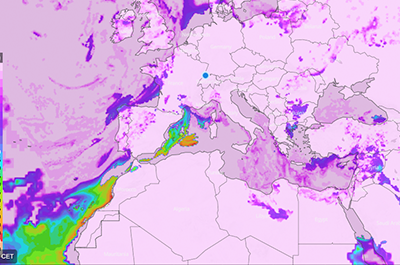
These maps show convective inhibition (CIN) with colours as defined in the colour scale. CIN is expressed in Joules per Kilogram (J/Kg). It indicates the amount of energy required to lift the parcel to the Level of Free Convection. The higher the CIN value, the lower the likelihood of convective storms. For more information, see convective inhibition.
Lifted index
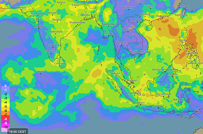
These maps show the dimensionless lifted index (LI). It is visualised with colours as specified in the colour bar. The more unstable the environment, the more negative the LI. For more information, see lifted index.
Storm helicity
These maps show the relative helicity in the indicated atmospheric layer (0-3 km) with colours in m²/s². Helicity is simply a measure of the amount of rotation found in a storm's updraft air. If there is significant rotation in a storm's updraft air, the storm will become more than likely a supercell and possibly spawn one or more tornadoes. For more information, see helicity.
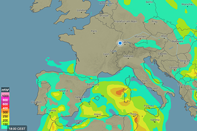
Solar radiation
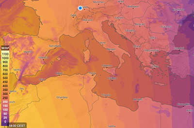
These maps show the expected incoming solar short wave radiation with colours as specified in the map legend. It represents the incoming solar radiation, and that is why it is mainly equal to zero during the night (no sun). This map gives also an indication on the cloud coverage. Radiation is expressed in Watt per square meter (W/m²). For more information, see radiation.
UV index
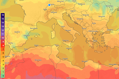
The ultraviolet index (UV Index) is an international standard measurement of the strength of the ultraviolet radiation from the sun at a particular place on a particular day. The different colours in the legend represent the different values of the UV Index. For more information, see UV index.
Extreme forecast
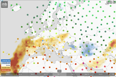
The extreme forecast map shows for which regions above-average warm (reddish) or below-average cold (bluish) temperatures are expected. The stronger the colours, the greater the deviation of the forecast values compared to the seasonally normal temperatures of a particular region.
Hiking trail map
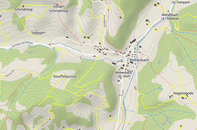
This map can help you plan your next hike. Well-developed roads are shown in white. Smaller roads (e.g. forest roads) are shown in yellow and trails in red.

