
Climate Comparison Diagram
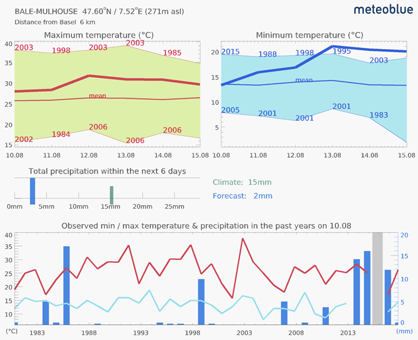
The diagram Climate Comparison shows the expected weather, compared to the weather of the previous 10 or more years. Thereby, you can see how "normal" the current weather is.
The diagram Climate Comparison looks for the closest place which has a weather station with minimum 10 years of reliable measurements available. The name of the place with the station is indicated in the meteogram title, as well as the distance from the selected place.
The temperature chart shows the range of maximum,
mean (thin line) and minimum temperatures of the past years, and the forecast of the next 6 days (thick line). The
total precipitation for the next days is shown in
the precipitation chart, relative to the average precipitation of the period during the last years.
The climate
chart shows temperature and precipitation of the current date as measured at the station on the same date during the
past years. Years without measurement are marked with a grey bar.
For the climate chart, the nearest weather station, for which reliable measurements over 30 years are available, is selected automatically. In hilly areas, this station can be located on a different altitude than the selected place. Therefore the climatic diagram shows the measurement and the forecast for this station, and not for the selected place.
The nearest weather station nevertheless shows the comparison of present to past weather in the environment of the selected place better than a more similar, but farther station. A selection of the station (filter: by altitude country, landscape, or others) would make more distant stations appear under several circumstances. Thus, the comparison with the weather (and climate) would become locally less relevant than the comparison with a neighbouring station - even if this station is located at a different altitude.
The direct comparison of the conditions at the selected place with the weather at the measuring station is possible if based on the forecast at both places, e.g. with the help of the meteogram All-in-one.
Current to climate
The current to climate meteograms enable a comparison of weather variables of the current season to the 30 year mean climate.
Monthly mean temperature
Description
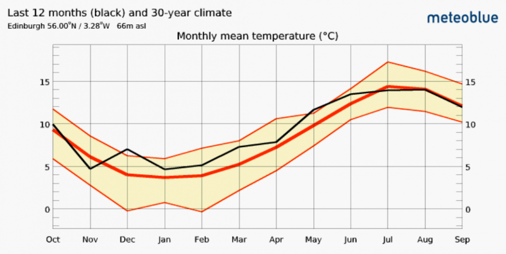
Monthly mean temperature
This diagram shows the current season compared to the average climate for a chosen place. The diagram is labeled with temperature and months.
- The black line shows the mean temperature for every month of the last 12 months (current).
- The thick red line shows the calculated mean temperature of the last 30 years for every month (climate). This line denotes the exact mean of the temperatures but does not reveal fluctuations of the temperature from year to year.
- The orange buffer around the red line makes the fluctuations between the last 30 years more visible. It shows in what range the temperatures of the last 30 years are distributed. It shows the maximum monthly mean and the minimum monthly mean of the last 30 years.
Interpretation
- The wider the buffer around the red line, the more fluctuations between the years are common in this month.
- If the black line runs outside of the orange buffer, this means that the temperature of the current month or season does not correspond to the usual average temperature expected in this place.
- If the black line lies within the orange buffer, this means that the current temperatures fit the usual climate.
Monthly precipitation
Description
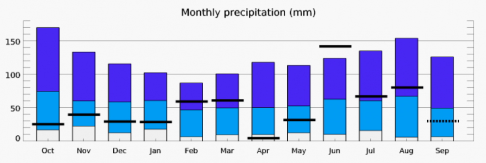
Monthly precipitation
The diagram for the monthly precipitation shows the amount of precipitation for each month of the last 12 months compared to the precipitation of the last 30 years. The graph is labeled with millimeters and months.
- The black bars show the recorded precipitation for each current month.
- The dark blue bars show the maximum amount of precipitation during the last 30 years for each month. The light blue bars show the minimum amount of precipitation during the last 30 years.
- The boundary between dark blue and light blue is the monthly mean precipitation calculated from the last 30 years.
Interpretation
- If a black bar is beneath the light blue bar or above the dark blue bar, this means that the current monthly sum of precipitation does not correspond to the 30 year average.
- The longer the blue bars, the greater the fluctuations of monthly precipitation are between the last 30 years.
- The shorter the blue bars, the less fluctuations there were in the last 30 years, which means that the amount of precipitation has been more constant.

