
Meteogram Short-term Verification
The Meteogram Short-term verification compares the predicted data with available measurement data from the closest weather measurement station and thus, a validation is created. The diagram is available for the past 3 or 7 days. The data is valid for the selected location in local time.
The Meteogram Short-term Verification for the past 3 days is available for free. The diagram for a verification length of 7 days is available via point+.
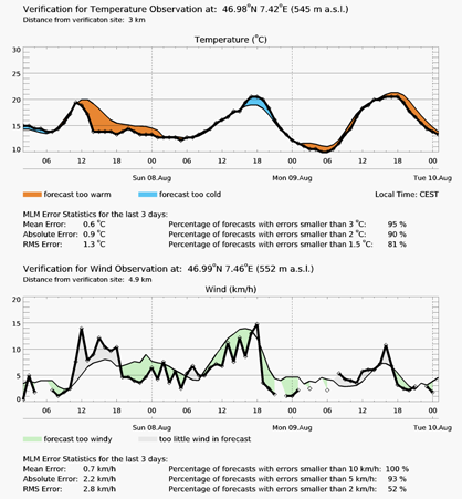
The thick black line shows the actual measured data from the closest weather station. The distance to this weather station is indicated under the heading.
This meteogram displays two weather variables: temperature (in °C) and wind speed (in km/h):
Temperature:
The first diagram shows a thick black temperature curve in steps of 6 hours.
The red areas show the forecast has been too warm and the blue areas show the forecast has been too cold. The smaller the areas the smaller the divergences.
Wind speed:
The second diagram compares the actual wind speeds and the predicted wind speeds in steps of 6 hours. The thick black line shows the actual wind speed.
The green areas indicate that the forecast has been too windy and the light grey areas show that there has actually been more wind than predicted.
Beneath each diagram you can find the error statistics for the past 3 or 7 days respectively: The mean error showing the average error of the respective period of time. For instance, positive values indicate that the predictions have been too warm and negative values were used to indicate that the forecast has been too cold. The absolute error is also indicated as well as the RMS error (Root Mean Square Error). The percentage of forecasts with defined errors is shown additionally.

