
MultiModel
The Meteogram MultiModel shows and compares the forecasts of each model. It is an addition to the meteogram and shows data at the altitude of the respective model grid cell. This can lead to differences and inconsistencies in the local temperature.
The goal of the MultiModel is not to make local predictions for the selected place, but to show the possible divergence of the evolutions of the weather, through the presentation of different models. For accurate local forecasts temperatures, please see the meteogram All-in-One. More details about uncertainty are explained by predictability.
Every model uses its own colour, that is used in all diagrams. The legend on the left has a list with the model names, their spatial resolution (in km) and the corresponding colours.
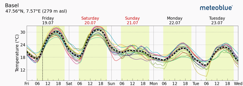
The first diagram shows the predicted temperatures. The time from sunrise to sunset is indicated as light yellow background. The dashed line indicates the average of all models.
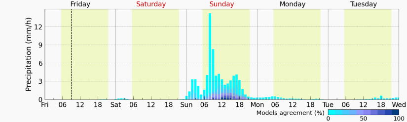
Blue bars indicate precipitation, the quantity is accumulated over one hour. The bars get darker when more models predict precipitation.
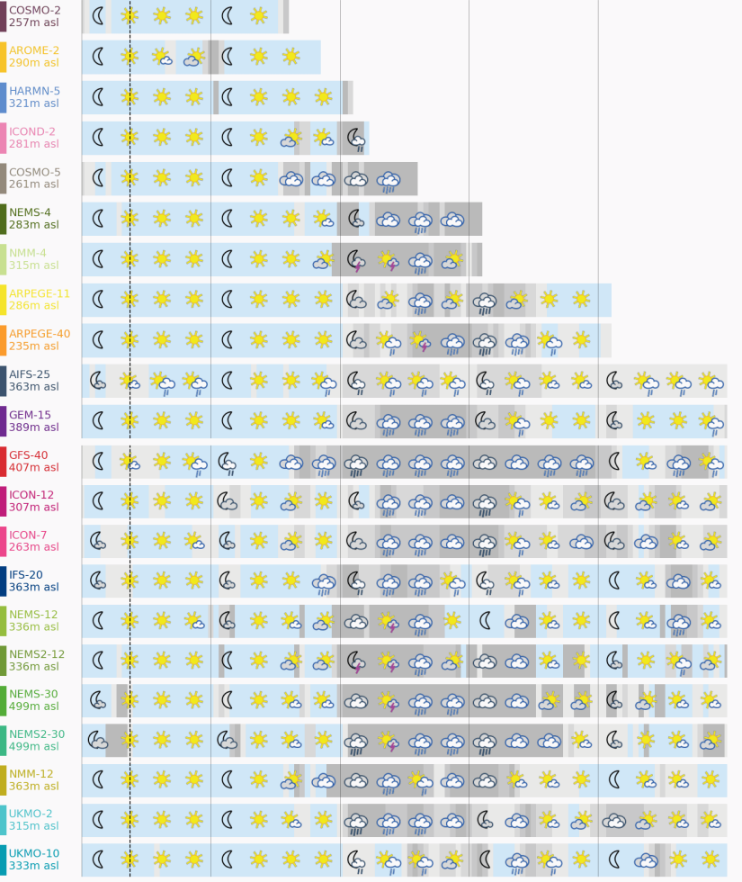
Weather icons are used to display the predicted weather conditions. The background is light blue for clear sky, light grey for sparser clouds, and dark grey for dense clouds.
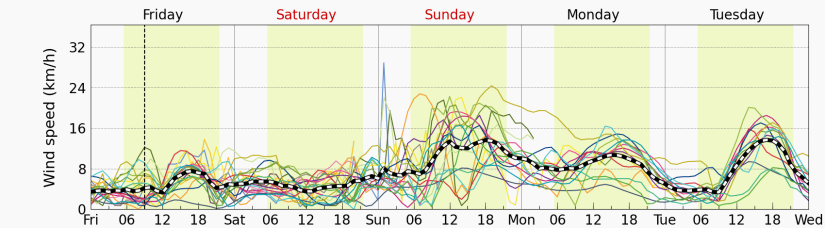
The fourth diagram shows wind speeds, in the same way as in the first diagram: The time from sunrise to sunset is indicated as light yellow background and the dashed line indicates the average wind speed of all models.
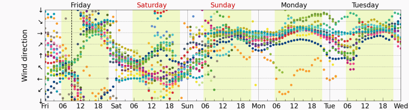
The next part shows wind direction, each dot representing a prediction by a model for a given timestep. Directions are shown along the vertical axis, starting with southbound winds at the bottom and rotating clockwise by 360 degrees towards the top of the axis.
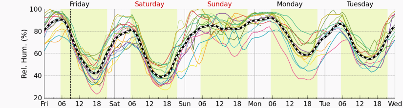
The last part of the MultiModel visualizes relative humidity forecast data calculated by the different models in %, indicating whether the air is completely dry (0%) or saturated (100%).
The number of models depends on the region: some models cover only certain areas (domains), so they will not appear in other areas.

