The Paris Agreement of 2015 sets out a global framework to limit global warming to well below 2°C, preferably to 1.5°C (degrees Celsius), compared to pre-industrial levels. To achieve this global temperature goal, countries aim to reduce growth of greenhouse gas emissions as soon as possible and rapid reductions thereafter, based on the best available science, economic and social feasibility.
The effects of climate change are already well visible by increasing air temperatures, melting glaciers and decreasing polar ice caps, rising sea levels, increasing desertification, as well as by more frequent extreme weather events such as heat waves, droughts, floods and storms. Climate change is not globally uniform and affects some regions more than others. On the following diagrams, you can see how climate change has already affected the region of Basel during the past 40 years. The data source used is ERA5, the fifth generation ECMWF atmospheric reanalysis of the global climate, covering the time range from 1979 to 2021, with a spatial resolution of 30 km.
The data will not show conditions at an exact location. Micro-climates and local differences will not appear. Therefore, temperatures will be often higher than those displayed especially in cities and precipitation may vary locally, depending on topography.
Yearly temperature change

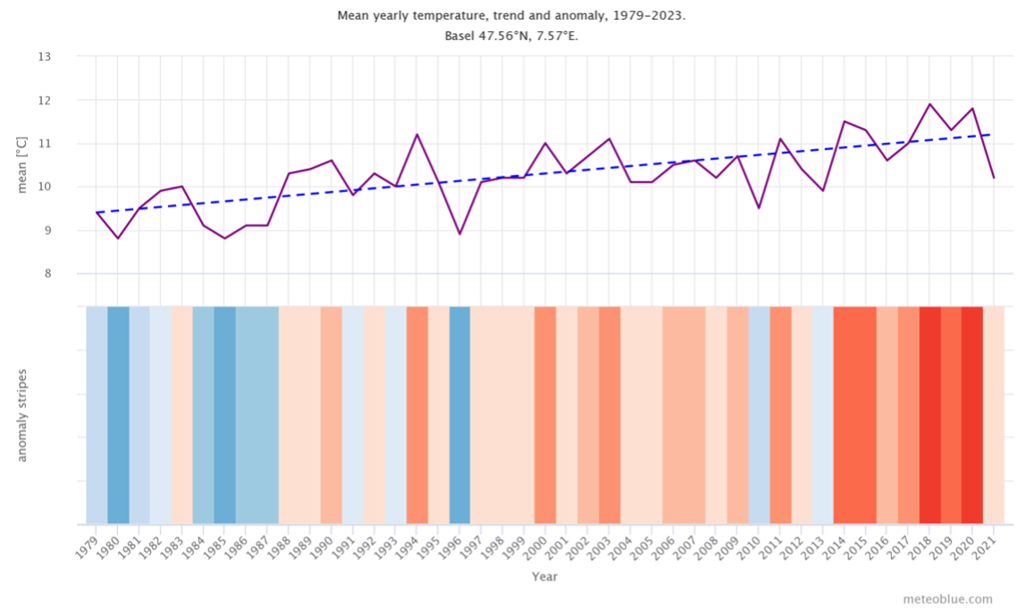
The top graph shows an estimate of the mean annual temperature for the larger region of Basel. The dashed blue line is the linear climate change trend. If the trend line is going up from left to right, the temperature trend is positive and it is getting warmer in Basel due to climate change. If it is horizontal, no clear trend is seen, and if it is going down, conditions in Basel are becoming colder over time.
In the lower part the graph shows the so called warming stripes. Each coloured stripe represents the average temperature for a year - blue for colder and red for warmer years.
Yearly precipitation change

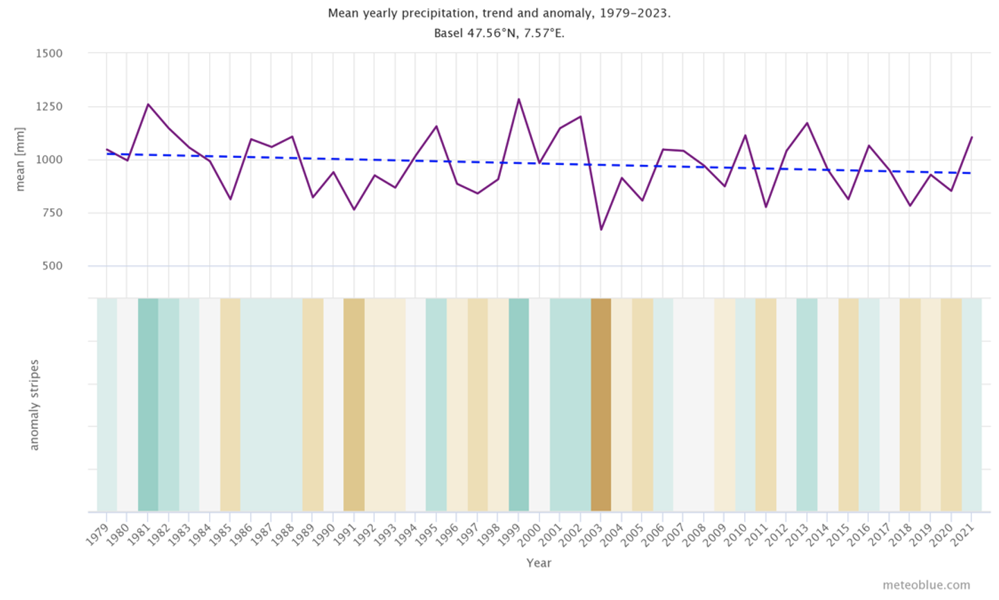
The top graph shows an estimate of mean total precipitation for the larger region of Basel. The dashed blue line is the linear climate change trend. If the trend line is going up from left to right, the precipitation trend is positive and it is getting wetter in Basel due to climate change. If it is horizontal, no clear trend is seen and if it is going down conditions are becoming drier in Basel over time.
In the lower part the graph shows the so called precipitation stripes. Each coloured stripe represents the total precipitation of a year - green for wetter and brown for drier years.
Monthly anomalies - Overview

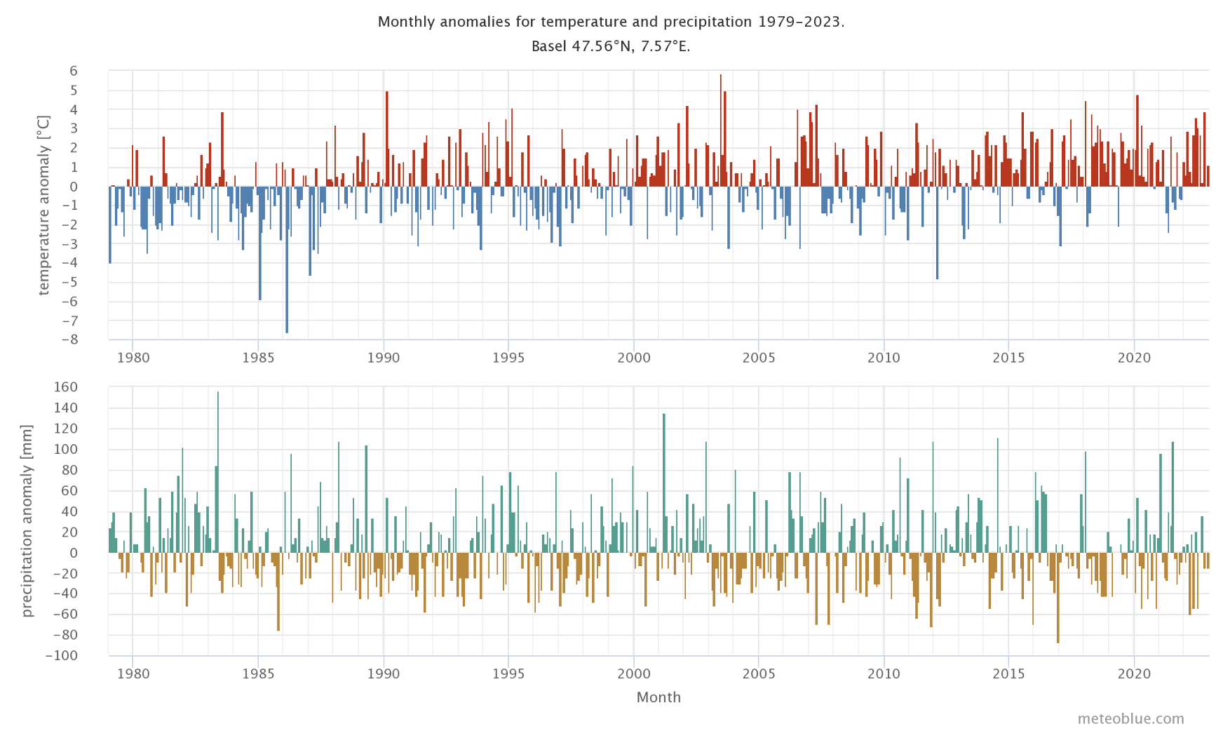
The top graph shows the temperature anomaly for every month since 1979 up to now. The anomaly tells you by how much it was warmer or colder than the 30 year climate mean of 1980-2010. Thus, red months were warmer and blue months were colder than normal. In most locations, you will find an increase of warmer months over the years, which reflects the global warming associated with climate change.
The lower graph shows the precipitation anomaly for every month since 1979 up to now. The anomaly tells you if a month had more or less precipitation than the 30 year climate mean of 1980-2010. Thus, green months were wetter and brown months were drier than normal.
Monthly anomalies - per month

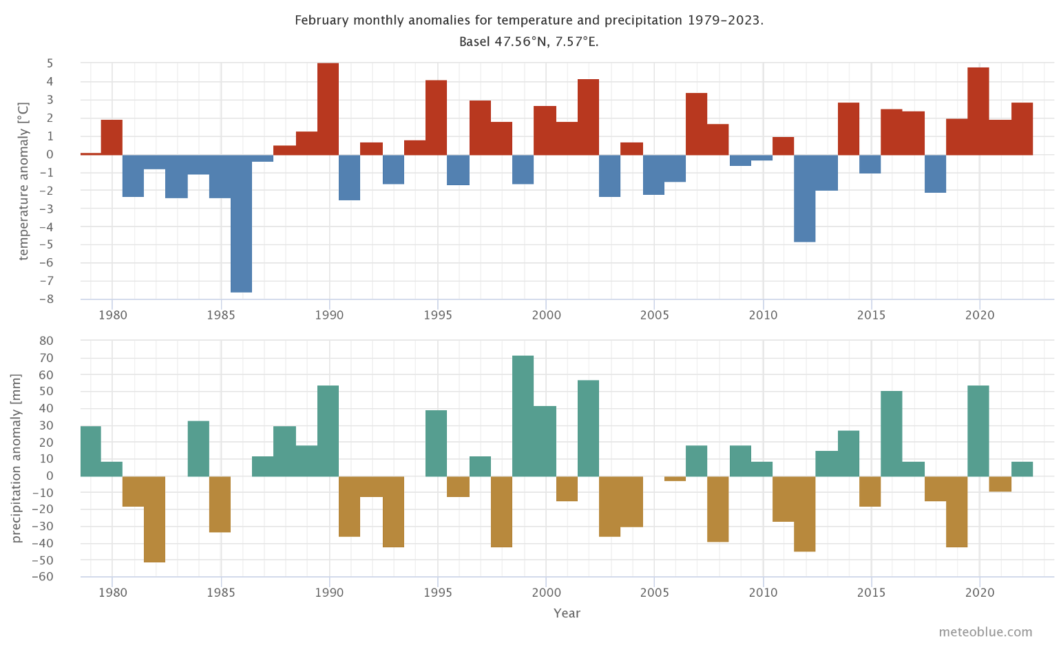
This graph focuses on the specified month. Every month can be displayed from 1979 until today. Thereby, you can see in which years a specific month was warmer or colder (drier or wetter) than normal.
Extreme events are not visible in these data - they may have different frequency, and critical thresholds may be surpassed at a higher frequency. Our history+ service gives you access to the detailled underlying hourly data, for the variables of temperature, precipitation and many more. The main question concerns the future: What will be the trend for the next 10-40 years? meteoblue can provide Climate data & maps or climate risk assessments for the next decades.


