
Risk assessment
The risk assessment diagram is part of history+ offer and displays the probability of a certain kind of risk during a year, as well as the event occurrences of the last 40 years, to reveal patterns. This diagram assists in weather depended decisions such as outdoor activities, vacation planning or sowing periods.
The risk assessment diagram is subdivided into 3 parts:
Years
The first diagram compares the event occurrences of the last 40 years. The y-axis shows the different years. This helps to differentiate seasons and assists in evaluating the probability of a certain event.
Likelihood
The second diagram shows the likelihood of a certain event in percent (%). The y-axis indicates the likelihood, whilst the x-axis displays the time frame for all diagrams.
Tolerable risk
The tolerable risk approximates the personal tolerable risk in percent (%). This enables the risk evaluation by taking into account divergences, which are personally acceptable. The y-axis indicates the tolerable risk in percent.
You can also switch between history+ locations by clicking on the box on the right. This is only possible if more than one history+ location is activated.
The diagram is automatically created once all required variables are defined.
The risk assessment diagram analyses different events and for those, a threshold value is individually defined.
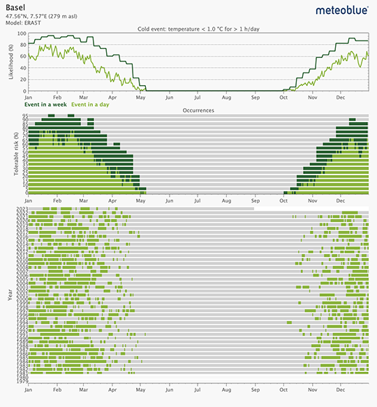
Cold and warm event:
Temperature is below or above a certain threshold for a certain time. The threshold is set for temperature values between 0°C and 43°C for warm events, as well as -30°C and 30°C for cold events. This is commonly used to evaluate frost. The first diagram shows the likelihood of the defined event. You can estimate your personal risk in the second diagram. For instance, if your personal tolerable risk for a frost event is 20% you should schedule sowing later (e.g. end of April). On the other hand, if you can accept 50% frost likelihood in favor of earlier sowing, you should sow earlier (e.g. beginning of march). The last diagram shows the occurrence of the defined event in the last 40 years for each year. You can also define the duration of an event.
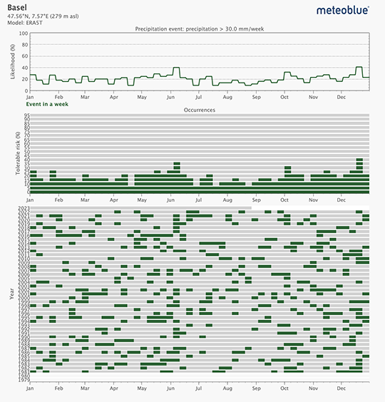
Precipitation:
This variable evaluates precipitation amounts in a week above a certain threshold and with the help of this representation; you can estimate strong precipitation events and schedule activities accordingly. The threshold for precipitation amounts needs to be defined between 1 and 100mm/week.
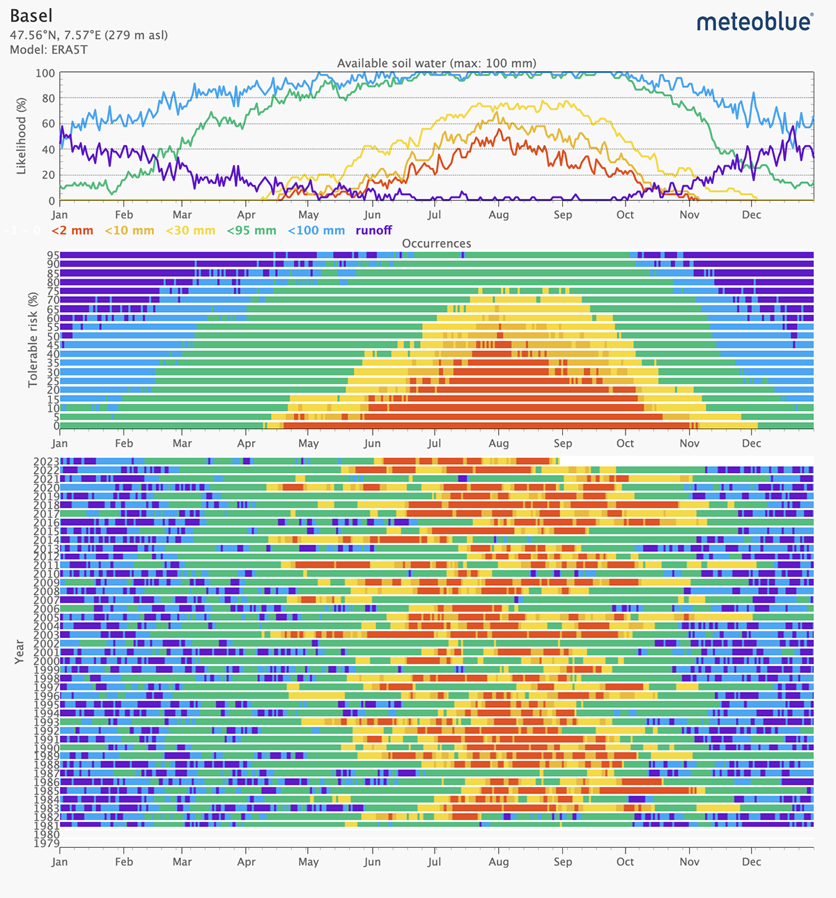
Water capacity:
Estimated probability of remaining soil water amount in millimeter (mm). Select the maximum amount of soil water capacity depending on your soil and crop type. Higher soil water capacities better indicate extreme dry seasons. The maximum available soil water capacity can be defined between 10 and 200 mm. Yellow, orange and red bars indicate almost depleted soil water.
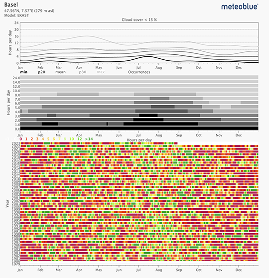
Cloud cover:
The cloud cover event indicates the cloud-free hours per day depending on the threshold, which can be defined between 15% and 100%. The first diagram shows the probabilistic distribution of cloud cover below a certain threshold. P80 indicated the second best and P20 the second worst out of 10 events. With this representation, you can statistically identify the period of time with the best cloud free days. The last diagram shows the actual occurrence of cloud free hours in the last 40 years.
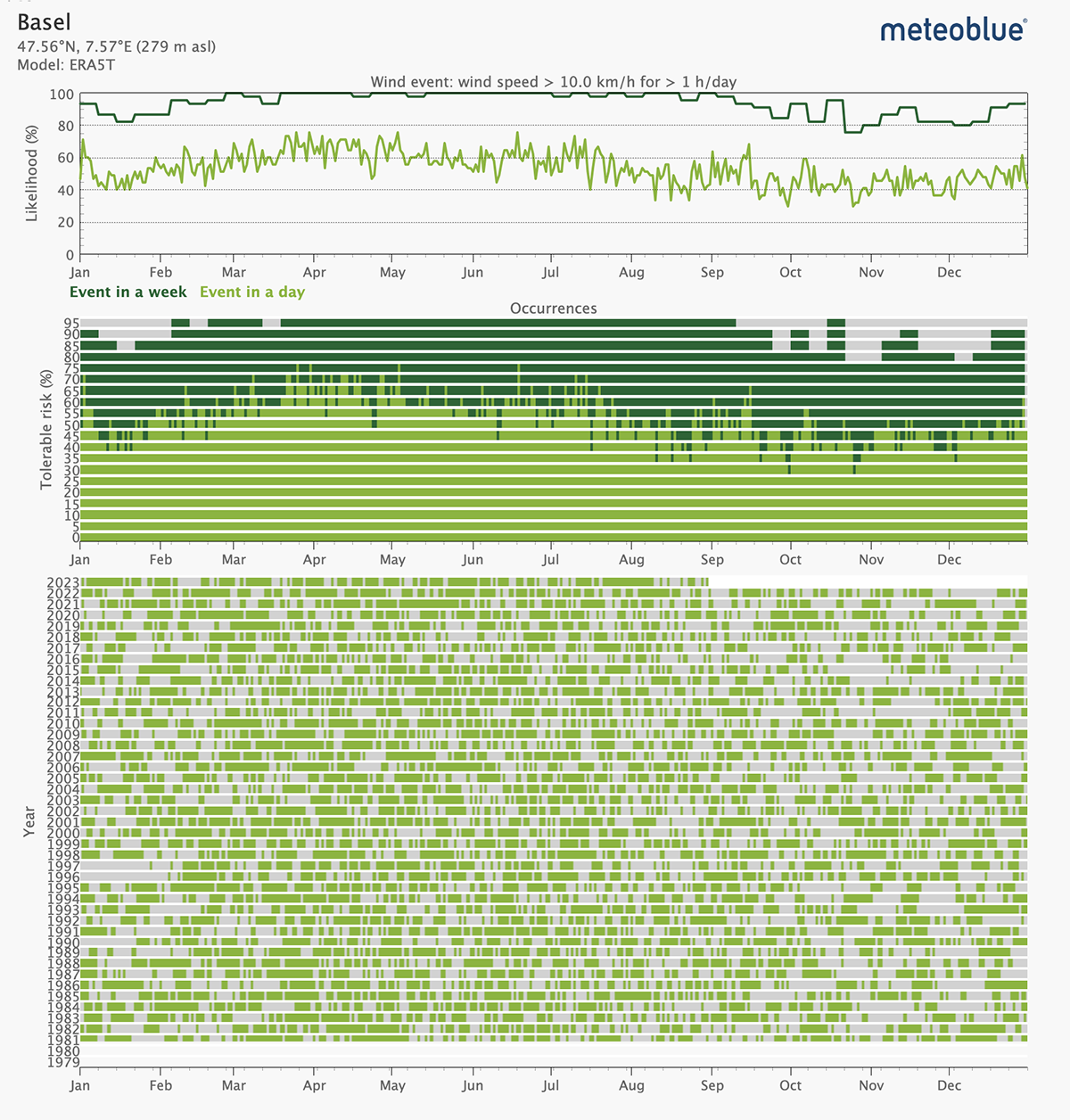
Wind speed and wind gust:
This variable evaluates high wind speeds or high wind gusts in a day above a certain threshold which can be defined between 1 and 40 m/s. You can also define the duration of an event. The first diagram shows the likelihood of the defined event over the year. With the second diagram, you can estimate the risk depending on your personal risk tolerance. The last diagram shows the occurrence of the defined event over the last 40 years.
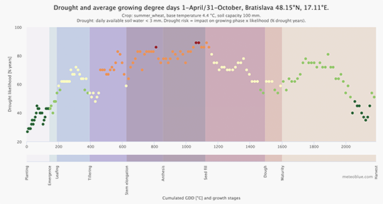
Crop risk:
The crop climate risk analysis investigates the risks of drought, heat, or frost for selected crops at a selected location for a chosen period in the time from 1985 to today.
history+ for Agriculture
In this video, we discuss the importance of accurate and reliable weather data for the segment of agriculture. We uncover some of the history of meteoblue and its connection to the agrifood segment, and describe how history+, one of our flagship products, assists farmers around the world in assessing a variety of risks related to their activities.

