
Climate Modelled Diagrams
The meteoblue Climate Diagrams are based on 30 years of hourly weather model simulations and available for every place on Earth. They give good indications of typical climate patterns and expected conditions (temperature, precipitation, sunshine and wind). The simulated weather data have a spatial resolution of approximately 30 km and may not reproduce all local weather effects, such as thunderstorms, local winds, or tornadoes.
Since 2007, meteoblue has been archiving weather model data. In 2014 we started to calculate weather models with historical data from 1984 onwards and generated a continuous 30-year global history with hourly weather data. The climate diagrams are the first simulated climate data-set made public on the net. Our weather history covers any place on earth at any given time regardless of availability of weather stations.
The data is derived from our global NEMS weather model at approximately 30km resolution and cannot reproduce detailed local weather effects, such as heat islands, cold air flows, thunderstorms or tornadoes. For locations and events which require very high precision (such as energy generation, insurance, etc.), we offer high resolution simulations with hourly data.
Average temperatures and precipitation
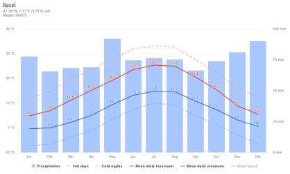
The "mean daily maximum" (solid red line) shows the maximum temperature of an average day for every month. Likewise, "mean daily minimum" (solid blue line) shows the average minimum temperature. Hot days and cold nights (dashed red and blue lines) show the average of the hottest day and coldest night of each month of the last 30 years. For vacation planning, you can expect the mean temperatures, and be prepared for hotter and colder days. Wind speeds are not displayed per default, but can be enabled at the bottom of the graph.
The precipitation chart is useful to plan for seasonal effects such as monsoon climate in India or wet season in Africa. Monthly precipitations above 150mm are mostly wet, below 30mm mostly dry. Note: Simulated precipitation amounts in tropical regions and complex terrain tend to be lower than local measurements.
Cloudy, sunny, and precipitation days
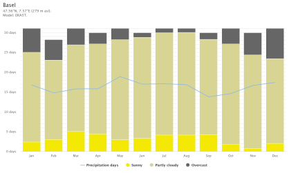
The graph shows the monthly number of sunny, partly cloudy, overcast and precipitation days. Days with less than 20% cloud cover are considered as sunny, with 20-80% cloud cover as partly cloudy and with more than 80% as overcast. While Reykjavík on Iceland has mostly cloudy days, Sossusvlei in the Namib desert is one of the sunniest places on earth. Note: In tropical climates like in Malaysia or Indonesia the number of precipitation days may be overestimated by a factor up to 2.
Maximum temperatures
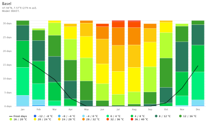
The maximum temperature diagram displays how many days per month reach certain temperatures. Dubai, one of the hottest cities on earth, has almost none days below 40°C in July. You can also see the cold winters in Moscow with a few days that do not even reach -10°C as daily maximum.
Precipitation amounts
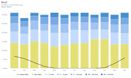
The precipitation diagram shows on how many days per month, certain precipitation amounts are reached. In tropical and monsoon climates, the amounts may be underestimated.
Wind speed

The diagram shows how many days within one month can be expected to reach certain wind speeds. Monsoons create steady strong winds on the Tibetan Plateau from December till April, but calm winds from June till October.
Wind rose
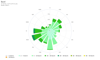
The wind rose shows how many hours per year the wind blows from the indicated direction. Example SW: Wind is blowing from South-West (SW) to North-East (NE). Cape Horn, the southernmost land point of South America, has a characteristic strong west-wind, which makes crossings from East to West very difficult especially for sailing boats.

